



How to Make YouTube Thumbnails That Get More Clicks
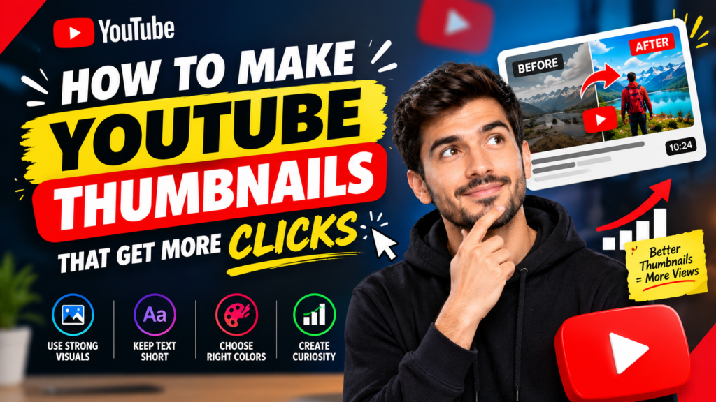
A great YouTube video can have valuable information, an engaging script, and excellent editing, but it still needs one thing to attract viewers: a thumbnail that makes people want to click.
Your YouTube thumbnail is often the first visual impression viewers get before deciding whether to watch your video. A well-designed thumbnail can communicate your video’s topic quickly, create curiosity, and encourage clicks without misleading the audience.
If you want to increase YouTube views and improve your channel’s performance, learning how to make YouTube thumbnails that get more clicks is an important skill. In this guide, you’ll learn practical thumbnail design strategies, common mistakes to avoid, and ways to create thumbnails that stand out.
Why YouTube Thumbnails Matter
YouTube thumbnails compete for attention alongside dozens of other videos. Whether someone discovers your content through search, recommendations, or the home page, your thumbnail can influence whether they stop scrolling and investigate your video.
A strong thumbnail should answer one basic question:
Why should I click this video?
The best thumbnails usually combine a clear visual idea with a compelling reason to watch. They don’t need to explain everything about the video. Instead, they should create enough interest for the viewer to want to know more.
Your thumbnail also works together with your video title. The title can explain the topic, while the thumbnail can visually reinforce the promise or create curiosity.
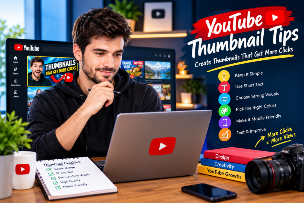
1. Keep Your Thumbnail Simple
One of the most common thumbnail mistakes is trying to include too much information.
A thumbnail is displayed in a relatively small space, particularly on mobile devices. If you add multiple images, long sentences, tiny details, and several design elements, viewers may struggle to understand the main idea.
Instead, focus on one primary message.
For example, instead of writing:
“10 Amazing Ways to Increase Your YouTube Channel Views in 2026”
you could use a shorter visual phrase such as:
“MORE VIEWS!”
The title can provide the additional context.
A simple thumbnail is easier to recognize and understand within seconds.
2. Use Short, Powerful Text
Text can be useful when it adds something that the image cannot communicate on its own.
However, avoid turning your thumbnail into a paragraph.
Try to use a few highly relevant words that support the video’s main idea. Examples include:
- GET MORE VIEWS
- 0 → 10K
- NEW STRATEGY
- DON’T DO THIS
- VIRAL?
- EASY SEO
- MORE CLICKS
Large text is particularly important because many viewers browse YouTube on smartphones.
Make sure your text remains readable even when the thumbnail appears as a small image.
3. Create a Strong Visual Focus
Every effective thumbnail should have a visual element that immediately attracts attention.
This could be:
- A person’s face
- A YouTube-related image
- A product
- A surprising result
- A before-and-after comparison
- A relevant object
- A strong visual symbol
- A screenshot showing an important result
Don’t make every element equally prominent. Give viewers one obvious focal point.
A clear visual hierarchy helps the viewer understand your thumbnail almost instantly.
4. Use Facial Expressions Carefully
Faces can be powerful thumbnail elements because people naturally notice facial expressions.
If your content includes a person, consider using an expression that matches the video’s subject.
For example:
- Surprise can support an unexpected discovery.
- Excitement can support a major achievement.
- Concern can support a mistake or warning.
- Curiosity can support a mystery or experiment.
The expression should make sense in the context of the video. Avoid exaggerated expressions simply because they are commonly used in thumbnails.
Authenticity can make your content feel more trustworthy.
5. Make the Thumbnail and Title Work Together
Your thumbnail and title should complement each other rather than repeat exactly the same information.
For example:
Title:
How to Get More YouTube Views Without More Subscribers
Thumbnail:
MORE VIEWS?
The title provides the specific information, while the thumbnail creates visual curiosity.
Another example:
Title:
I Tested 5 YouTube Thumbnail Strategies
Thumbnail:
WHICH ONE WON?
This combination gives viewers a reason to investigate the video.
6. Use Contrast to Stand Out
Your thumbnail needs to remain visible among other videos.
Contrast can help separate important elements from the background.
You can create contrast through:
- Light and dark areas
- Different text and background tones
- Strong separation between foreground and background
- Distinct visual elements
- Clear borders or outlines
The goal isn’t to make your thumbnail as colorful as possible. The goal is to make its important elements easy to see.
7. Choose Colors Strategically
Color can influence how quickly a thumbnail catches attention.
Rather than using every color available, select a small palette that fits your channel’s visual identity.
For example, you might consistently use:
- One primary background color
- One accent color
- A contrasting text color
- Neutral tones for supporting elements
Consistency can also make your videos more recognizable when viewers see several thumbnails from your channel.
8. Use High-Quality Images
Low-resolution images can make a thumbnail look unprofessional.
Start with a high-quality source image whenever possible. Make sure the subject is sharp, properly positioned, and easy to identify.
Avoid:
- Blurry photos
- Extremely compressed screenshots
- Poorly cropped subjects
- Distracting backgrounds
- Images that don’t relate to the video
A clean, high-quality visual can immediately improve the perceived quality of your content.
9. Create Curiosity Without Misleading Viewers
One of the most effective thumbnail techniques is creating curiosity.
A thumbnail doesn’t need to reveal the entire story. It can introduce a question or show an intriguing result that encourages viewers to watch.
For example:
Thumbnail:
“0 → 100K”
Title:
How I Grew a YouTube Channel From Zero
The viewer can immediately understand the potential result while still having a reason to watch the video.
However, don’t use a thumbnail that promises something your video doesn’t deliver. Misleading thumbnails may attract clicks, but they can create a poor viewing experience and damage audience trust.
10. Use the Rule of Visual Hierarchy
Visual hierarchy determines which elements viewers notice first, second, and third.
A simple hierarchy might look like this:
Primary: Main subject
Secondary: Short thumbnail text
Supporting: Background or small visual elements
If everything is large, bright, and bold, nothing stands out.
Give the most important element the greatest visual emphasis.
11. Don’t Copy Other Creators Exactly
Studying successful YouTube thumbnails can help you understand what works in your niche, but copying another creator’s design isn’t a good long-term strategy.
Instead, analyze successful thumbnails and ask:
- What catches my attention first?
- How much text is being used?
- Where is the main subject positioned?
- What makes the thumbnail easy to understand?
- How does the thumbnail work with the title?
- What creates curiosity?
Then apply those principles to your own brand and content.
12. Design for Mobile Viewers
A large portion of YouTube browsing happens on mobile devices, so your thumbnail should work at a small size.
Before publishing, reduce the thumbnail to a small preview and ask:
Can I still understand what this video is about?
If the text becomes unreadable or the main subject disappears, simplify the design.
This is one reason short text, strong contrast, and clear subjects are so important.
13. Use the Right Thumbnail Dimensions
For YouTube videos, use a high-resolution thumbnail with a widescreen layout that matches the platform’s recommended format.
A commonly used YouTube thumbnail size is:
1280 × 720 pixels
Maintain a 16:9 aspect ratio and use a suitable image format such as JPG or PNG.
Always keep important text and subjects away from the edges so they remain clearly visible.
14. Test Different Thumbnail Concepts
There isn’t one universal thumbnail style that works for every channel.
Different audiences respond to different visual approaches.
You can experiment with:
- Different headline lengths
- Close-up versus wider images
- Face versus object-focused designs
- Different backgrounds
- Question-based thumbnails
- Result-focused thumbnails
- Minimal designs
- Before-and-after concepts
Keep track of how your videos perform and look for patterns.
Over time, you can develop a thumbnail style that fits your specific audience.
15. Use Thumbnail Tools
You don’t need advanced graphic-design software to create effective YouTube thumbnails.
Several types of tools can help you create professional designs, including:
- Online graphic design platforms
- Photo-editing software
- AI-assisted design tools
- Background-removal tools
- Image editing applications
- YouTube-focused thumbnail templates
The tool matters less than the design principles you use.
A simple, well-designed thumbnail can outperform a complicated design if it communicates the video’s value more effectively.
Common YouTube Thumbnail Mistakes to Avoid
Even a visually attractive thumbnail can perform poorly if it contains common mistakes.
Too Much Text
Long sentences are difficult to read quickly. Keep thumbnail text concise.
Poor Image Quality
Pixelated or blurry images can reduce the professional appearance of your content.
Cluttered Design
Too many objects compete for attention and make the main message unclear.
Weak Contrast
If the text blends into the background, viewers may not notice it.
Misleading Images
A thumbnail should accurately represent the video.
Repeating the Title
Your thumbnail doesn’t always need to repeat every word from your title. Use it to add another layer of information or curiosity.
Inconsistent Branding
Using completely different designs for every upload can make your channel harder to recognize.
A Simple YouTube Thumbnail Formula
If you’re unsure where to begin, try this simple formula:
One Main Subject + Short Text + Strong Contrast + Curiosity
For example:
Main Subject: YouTube analytics screenshot
Text: “10K VIEWS!”
Title: How I Got My First 10,000 YouTube Views
The thumbnail communicates the result visually while the title provides context.
How to Make YouTube Thumbnails That Get More Clicks
Creating better thumbnails isn’t about making the most complicated design. It’s about communicating an interesting idea quickly.
Start by identifying the most compelling part of your video. Then turn that idea into one clear visual concept.
Use a strong subject, keep the text short, create enough contrast, and make sure the thumbnail works with your title.
Most importantly, continue experimenting. Your audience’s response can teach you which visual styles work best for your particular content.
Final Thoughts
Learning how to make YouTube thumbnails that get more clicks can have a significant impact on your channel’s ability to attract viewers. A thumbnail should be clear, visually appealing, relevant to the video, and designed to create genuine curiosity.
Focus on simplicity rather than clutter. Use high-quality visuals, readable text, strong contrast, and a clear focal point. Pair your thumbnail with a compelling but accurate title, and continue testing different approaches.
Remember that a thumbnail’s job isn’t to tell the entire story. Its job is to make the right viewer interested enough to discover what your video has to offer.
With consistent practice and experimentation, you can develop a recognizable thumbnail style that helps your videos stand out and attract more clicks.